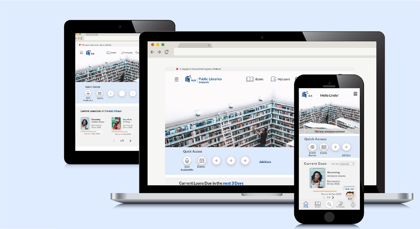
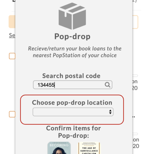
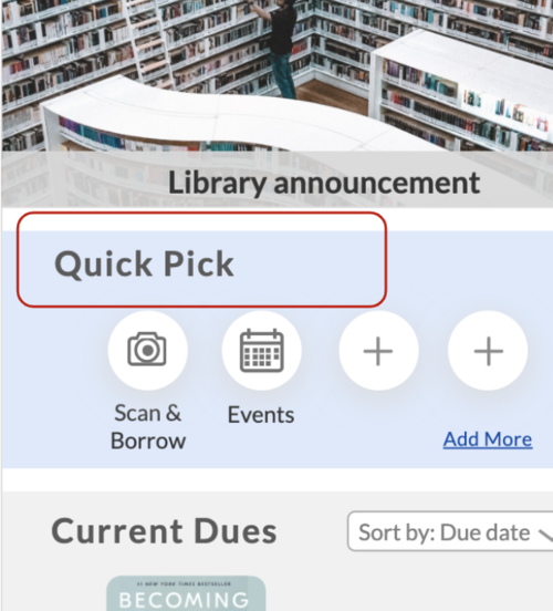
Worknlb

Mobile App & Responsive Website Redesign

National Library Board (NLB), Singapore

Redesigned the app for National Library Board (NLB) for a better experience & adapted it to a responsive website.

Project Details

Project Type: Group (team of 4), as a part of UXDI Course 
Role: Co-Researcher, Co-Designer, Prototype (App), Partial role in Usability Test
Duration: 2 weeks (May 2020)
Tools: Sketch, InVision, Axure, Miro & Trello

Background

The National Library Board (NLB) has 26 Public Libraries in
Singapore, with 26 million visitors in 2019 alone and an overall
reach of 7/10 residents. The current app has 610,000 downloads
to date and 40.52 million books have been borrowed from the
library till date.

Understanding the Goal
Knowing the User
Analysing the Scope

Define the User
Designing User Flow
Planning the Sitemap
Conceptualising the Features

Setting the Design Tone
Creating Prototypes
Testing the Prototypes

Final Prototype
Responsive Design
Next Steps

click on the section headers to jump to the section

Discover

Understanding the Goal

To understand why users use the app & other platforms of NLB, their motivations & pain points
while using the same.

Knowing the User

Who are the users?

In order to understand the quantitative data – the most preferred platform & the most frequently used features, we conducted a short survey.

To get more qualitative insight on the user’s experience using their preferred platform, which was the app, we conducted a remote interview with 12 participants.

click on the image to enlarge

click on the image to enlarge

Some user insights

  • Most of the users prefer using mobile app or desktop to access NLB services

  • The most frequently used features are to borrow books & ebooks, extend due date of current book loans and look for events)

  • They visit the library to pick up / return books or to study there

  • Most of the users fail to return book loans on the due date & end up paying fines despite receiving frequent reminders

Analysing the Scope

Comparative Analysis

Since the library does not have any direct competitor, we compared the book pick up & return process with some e-commerce & food delivery services to see if there can be some other way to pick up / return books apart from going to the library.

Heuristic Evaluation

Using Jakob Nielsen’s 10 general principles for interaction design, we evaluated the existing app & worked upon resolving the ones with the maximum severity rating.

Current Issues

We also conducted a usability test on the current app with 6 users, to understand the scope of improvement. We gave them 3 tasks including finding an ebook to borrow it, a physical book to reserve it and extending a current book loan. Below are some common issues that  the users mentioned.

  • the book format is not very clear

  • there is no option to search within the ebooks category

  • it was difficult to locate loans, the most used feature

  • there were multiple icons of the same design, confusing the user about its content

Define

Defining the User

User Persona

Problem to Solution

Problem #1: Lindy needs a way to access her most frequently used features easily in order to save time wasted in locating the features.

Solution #1: Quick Access
With this editable tab, Lindy can choose the features she wants to see on her home screen.

Problem #2: Lindy needs a convenient way to return her book loans so as to avoid paying fines repeatedly & making a trip to the library just to return the books.

Solution #2: Pop-drop
This feature available to premium members will allow Lindy to drop the book loan & pick up the reserved book at the nearest pop-station of her choice.

Designing User Flow

The flow suggests the process of the most common actions that the user would perform on the app - searching for a book to borrow, extending an existing book loan & use the newly added pop drop feature. to drop the book at the pop station.

Planning the Sitemap

The flow below suggests the process of the most common actions that the user would perform on the app - searching for a book to borrow, extending an existing book loan & use the newly added pop drop feature to drop the book at the pop station.

Conceptualising the Features

Develop

Setting the Design Tone

We used the font family mentioned in the government design system & the colours used in the logo as the primary & secondary colours. For the icons, we recreated them using a similar style as mentioned in the existing design system.

Creating Prototypes

Sketches
As a team, we sketched out some designs based on the features ideated.

Version #1: We discussed & combined all the sketches to create the first draft of our prototype.

Testing the Prototypes #1

We conducted a usability test with 5 users using 5 tasks – 3 similar to the usability test conducted for the existing app and 2 new tasks using the newly added features – quick access & pop drop.

3/5 users

liked the idea of the pop-drop but were confused at first as to what it was

2/5 users

did not notice the format icon on the cover of the book

3/5 users

felt that the easy access section should be more prominent

Version #2: We made design changes as per the design system and developed the interactions further to arrive at a high fidelity prototype.

Click here to view the prototype in browser

Testing the Prototypes #2

We conducted a second round of usability test with 5 users using all the 5 tasks as used for the earlier round.

2/5 users

tried to tap on the dropdown box before entering the postal code which is enabled only after confirming the code

2/5 users

were not sure how the QR code works & where can they access it later

2/5 users

were not familiar with the term “Quick Pick”

Deliver

Final Prototype

We improvised further on the design & features and made changes as per the feedback received during the usability test – renaming Quick Pick to Quick Access, a more known term as it used in Google Drive as well and adding more details to QR code access.

Click here to view the prototype in browser

Responsive Design

As per survey results, most users use either mobile or desktop. We applied the features & design used in the app for the responsive design for a website. The features like scanning the barcode were restricted to the app only, rest were carried forward to the responsive versions as well.

Next Steps

  • To develop and expand on identified features such as Seat Availability

  • To explore on the targeted groups to have a customised experience

    • Researchers/Students

    • Teachers

    • Seniors

    • Children

To explore and research ways to make library experience more engaging (E.g. Book club)

View other Case Studies

Remote Wound Care Solution

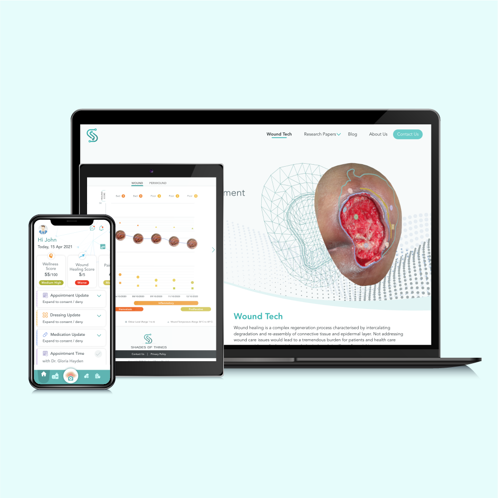
ShadesOfThings, Singapore

Post Op Remote Orthopaedic Care

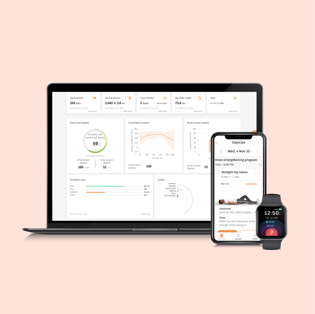
ConnectedLife Health, Singapore

e-Commerce Website Redesign

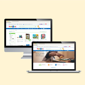
Toys”R”Us, Singapore

Mobile Game
Suggestion App

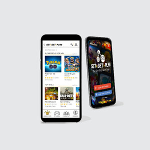
Set Get Play (Newly Developed)

HRMS Sales
Website

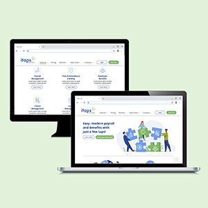
Itaps by Mind Master Solutions, Singapore