Worktru

e-Commerce Website Redesign

Toys”R”Us, Singapore

Redesigned the current e-commerce website of Toys”R”Us, adding more features for the users with an aim to increase the rate of online conversion.

Project Details

Project Type: Individual, as a part of UXDI course
Role: Research, Wireframe, Visual Design, Prototype, Usability Test
Duration: 2 weeks (April 2020)
Tools: Sketch, InVision, Miro & Optimal Sort

Background

Toys”R”Us, one of the most established & preferred toy store franchises in Singapore, aims to expand its e-commerce platform to help customers to shop from their comfort zone thus increasing the company’s online presence & footfalls.

Understanding the Goal
Knowing the User
Analysing the Scope

Defining the User
Designing User Flow
Planning the Sitemap
Conceptualising the Features

Creating Prototype
Testing the Prototype

Final Prototype
Next Steps

click on the section headers to jump to the section

Discover

Understanding the Goal

To understand the buying behaviour & preferences of people who buy toys online & offline, their key decision making factors.

To determine features that can make their online buying easy and enhance their experience further.

Knowing the User

Who are the users?

A remote interview with 8 participants, some of whom are loyal & some who are infrequent in store customers, were conducted
to help in understanding user expectations when they are shopping for toys online.

A usability test done on the current website also helped in identifying the issues users face while using the website.

Some user insights

  • There’s a split between online & offline buyers wherein online buyers consider reviews, recommendations, delivery time & detailed pictures / videos as their key determination factors

  • Online buyers prefer a smooth checkout flow with multiple login & payment options

  • Buyers look for promos specially when buying online

  • Most of them with toddlers or young kids do not prefer to take their kids for shopping

  • When buying for own kids, they prefer to buy online especially if good deals are on offer, as there is no time constraint & they are clear on what the kid wants & searching online is easier

  • When buying gifts, they prefer going to the store there isn’t enough time for the online delivery to arrive. Not sure of other’s choice hence prefer browsing through which may be better if they are at the store.

  • The basis on which most of the users decide what to buy is – age, in some cases gender, price & what the kid wants or would like / would help them learn

Current Issues

With a usability test done with 3 users on the existing website – asked them to search for a toy robot without using search, they shared:

  • The appearance & the layout is cluttered & they cannot focus on what they have to find

  • The navigation could cover second level links as well instead of opening up new pages, as it is time consuming

  • The products can be categorised from the user’s perspective as they were not able to find the robot in the category they expected it to be in

  • More product details, videos, good quality pictures can be added to explain the play mechanism of the product

Analysing the Scope

Competitive Analysis

A competitive analysis conducted with key online & in-store competitors to understand & compare some features that they offer.

Comparative Analysis

A comparative analysis conducted to check what some other brands / websites are offering and understand how they can be incorporated in our design.

Plus & Delta Analysis

As per the user interviews conducted, Amazon was the most preferred choice of the users for shopping online for toys. A plus & delta analysis was conducted to understand the scope of improvement & features that can be added.

Define

Defining the User

User Persona

Problem to Solution

Problem #1: Angela needs more details,  pictures & videos of the product in order to understand the functioning of the product before buying.

Solution #1: Additional Product Details
Users can view more consistent product details, images & videos of play mechanism (where applicable).

Problem #2: Angela needs an option to get quick delivery & to know the estimated delivery date so that she can buy gifts for upcoming occasions in time.

Solution #2: Additional Delivery Details
Users can now opt for Express Delivery with a nominal top-up amount / Free next day delivery (for members) and can view the estimated date of delivery before placing the order.

Problem #3: Angela needs to navigate around all the product categories quickly & easily in order to save time in loading the page every time she switches a category. 

Solution #3: Broader Navigation
Users can browse through the product categories, subcategories & brands from any page via the global navigation.

Card Sorting

To understand how users would like to categorise the varied product options available, an open card sort activity with 7 users was performed. The category & subcategory of the products are defined using the card sorting analysis.

Designing User Flow

The user flow is to get a better understanding of the user’s action on the website & the ease of checkout process leading to conversions.

Planning the Sitemap

Conceptualising the Features

Develop

Creating Prototypes

Version #1
Click here to view the prototype in browser

Testing the Prototypes #1

4 users were given the task to find LEGO Star Wars Droid Commander using links on global & local navigation (without using search)

3/4 users

felt that the search bar with filters was confusing & not important, especially classifying using gender can be debatable, they were felt that the compare feature was of no use to them

2/4 users

felt that the navigation dropdown for categories is looking cluttered & can be simplified

2/4 users

also felt that the product image on the product list page can be bigger as it was not clearly visible along with some minor design changes

Deliver

Final Prototype

Presenting the final prototype with templates of some key pages & the checkout flow.

Click here to view the prototype in browser

Next Steps

  • One more round of usability test to understand user behaviours further

  • Adding the option to choose delivery time / time slot notification

  • Structure & design for the Toy LookBook & other sections

  • Add more value added features for Star Card Members

View other Case Studies

Remote Wound Care Solution

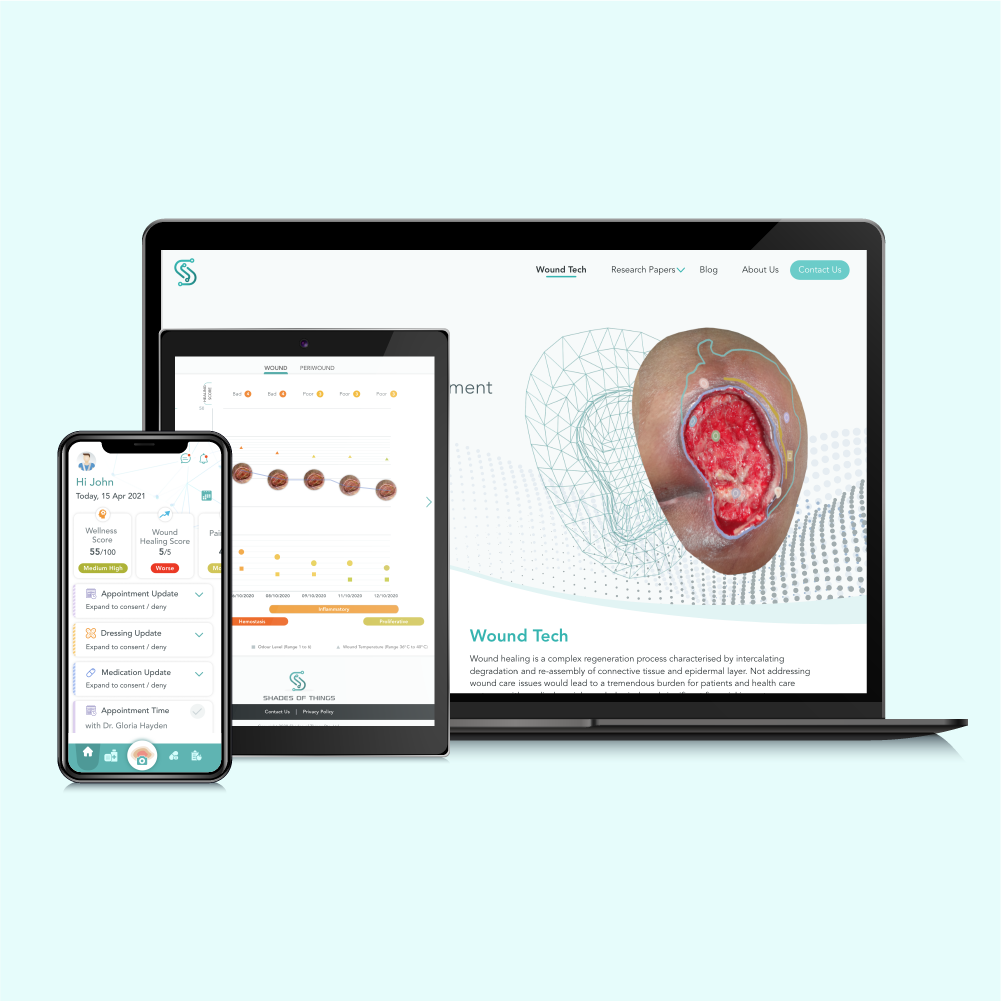
ShadesOfThings, Singapore

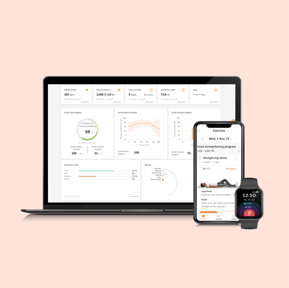
Post Op Remote Orthopaedic Care

ConnectedLife Health, Singapore

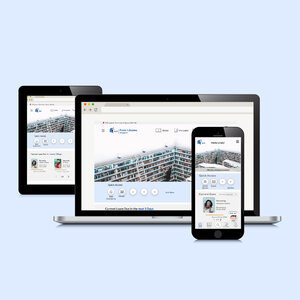
Mobile App & Responsive Website Redesign

National Library Board (NLB), Singapore

Mobile Game
Suggestion App

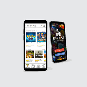
Set Get Play (Newly Developed)

HRMS Sales
Website

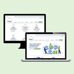
Itaps by Mind Master Solutions, Singapore