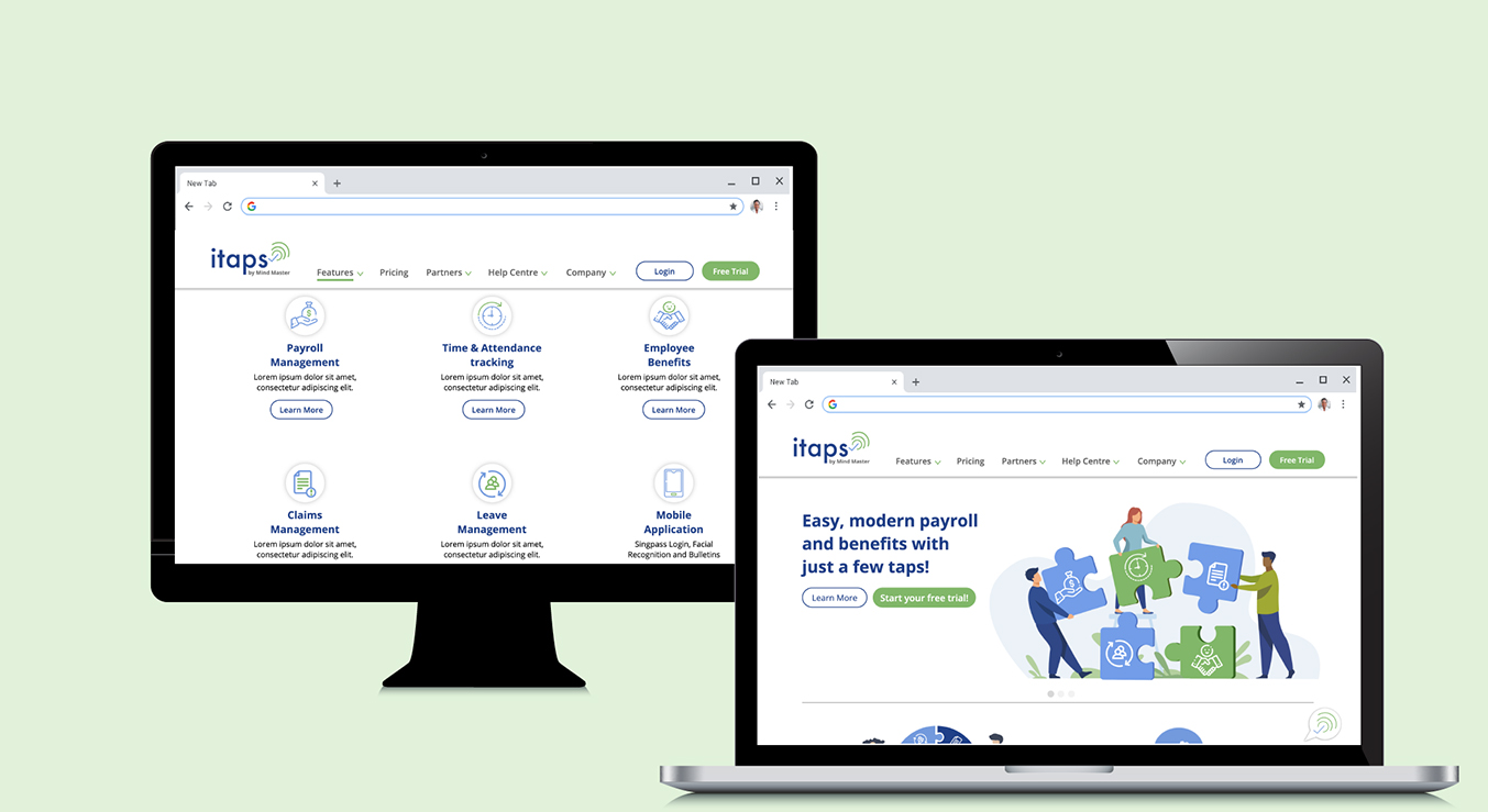
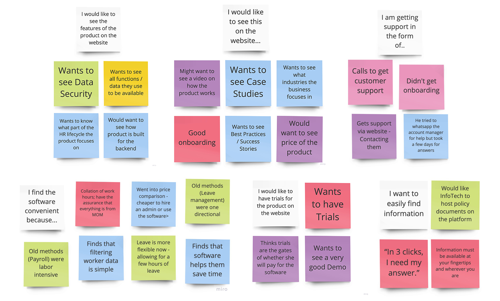
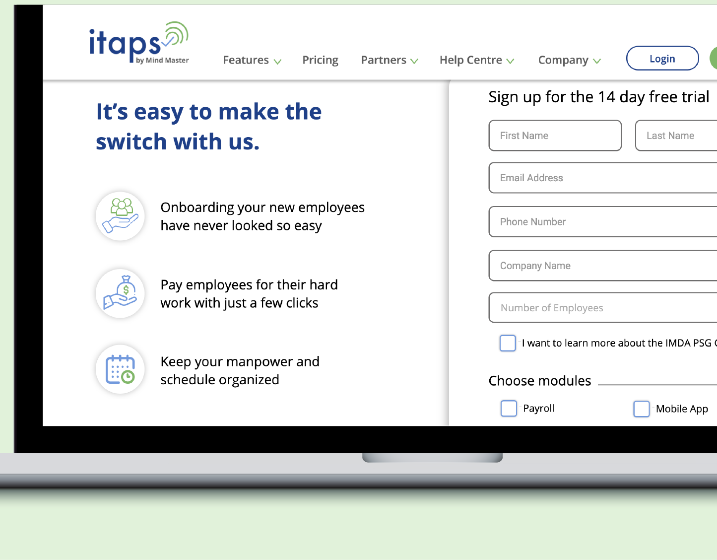
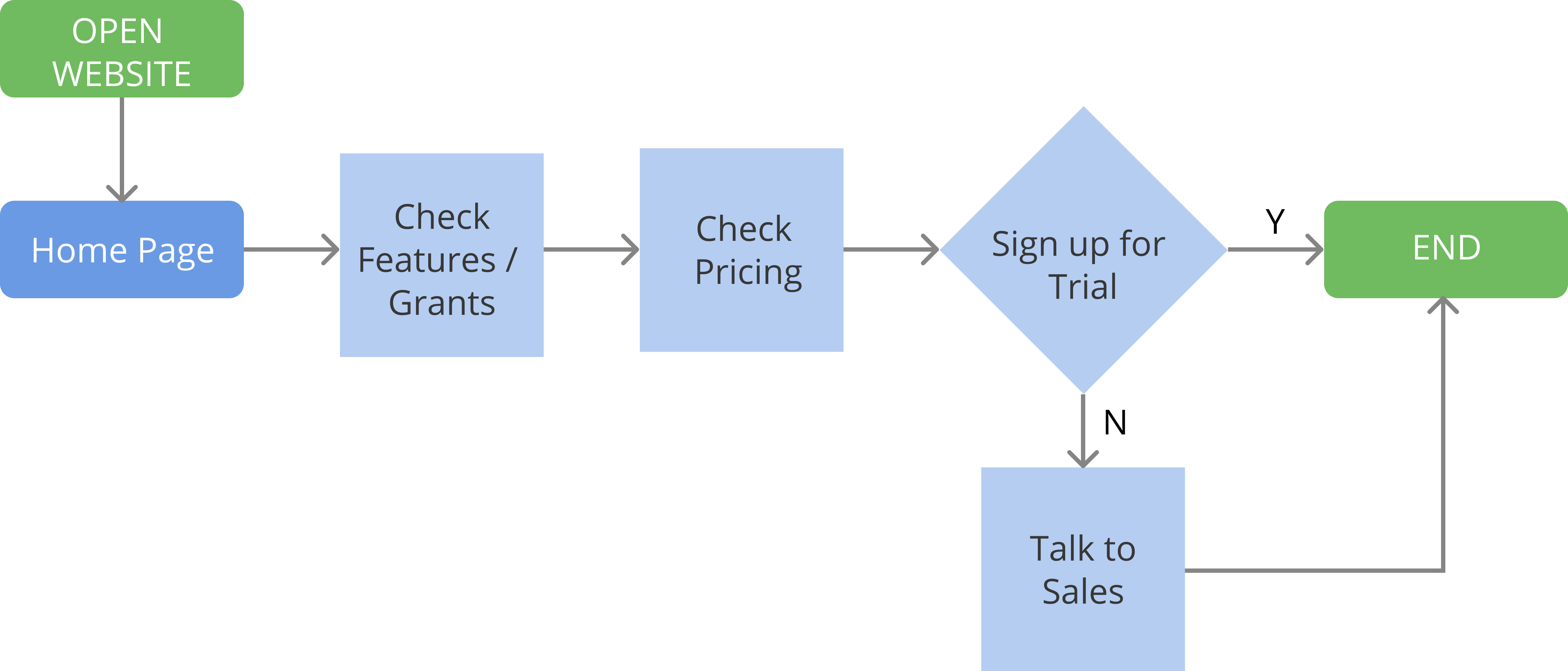
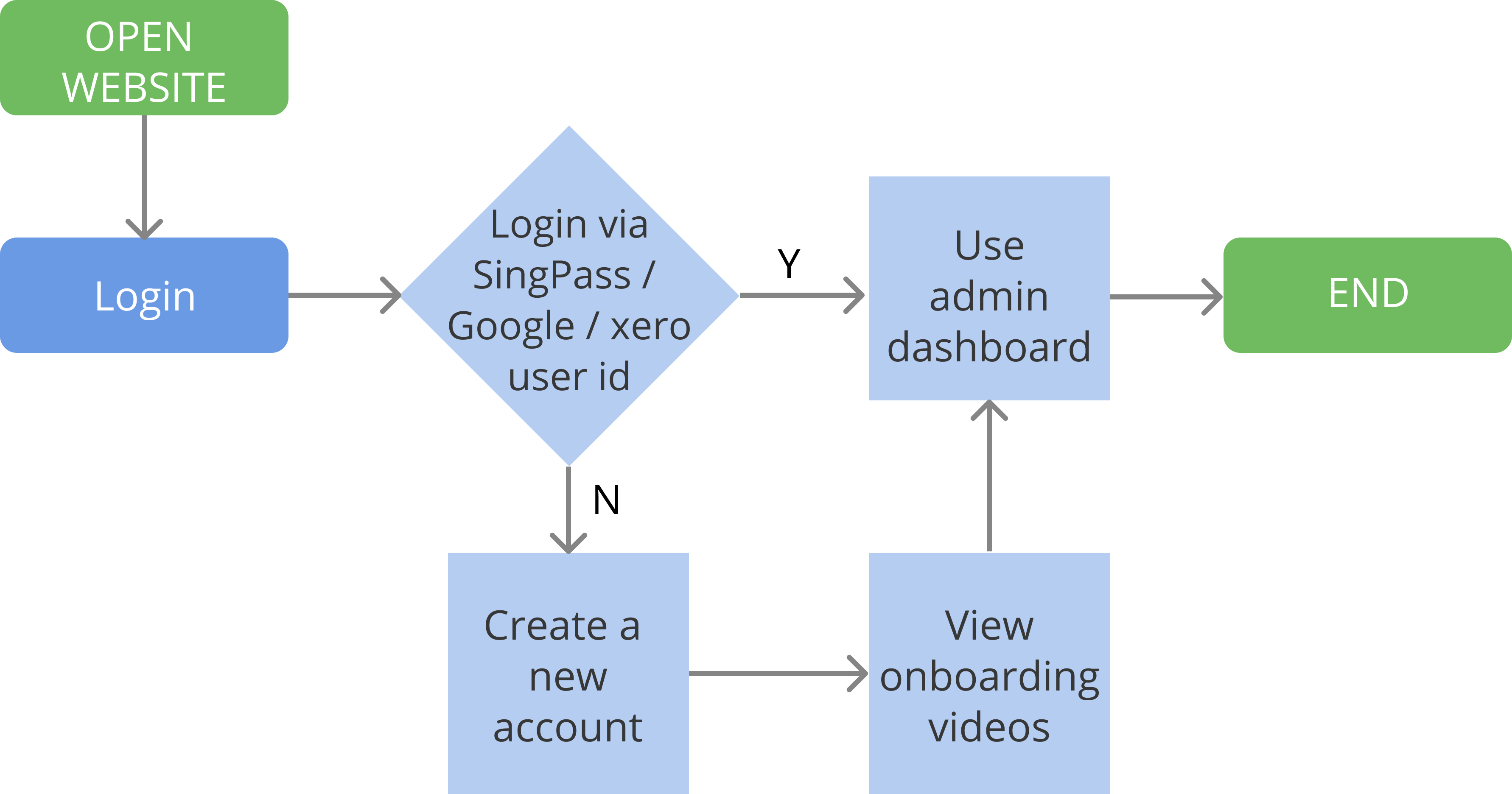
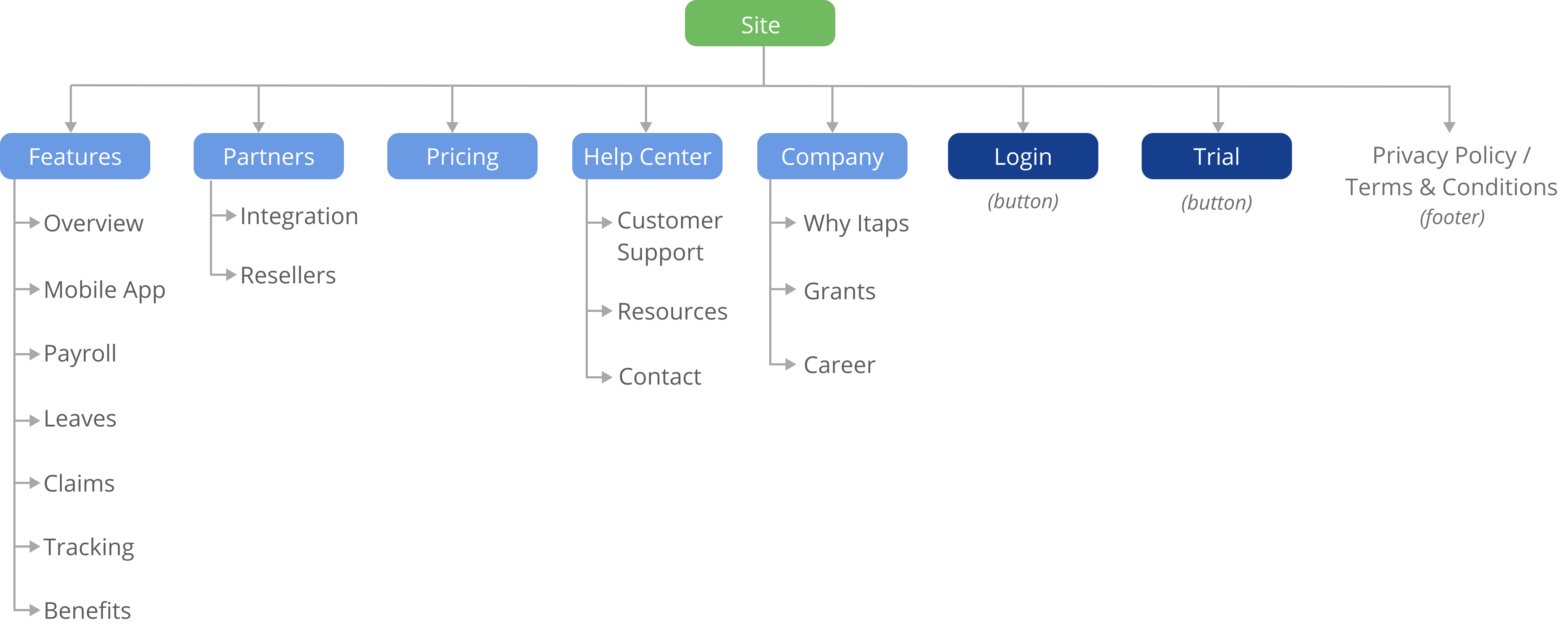
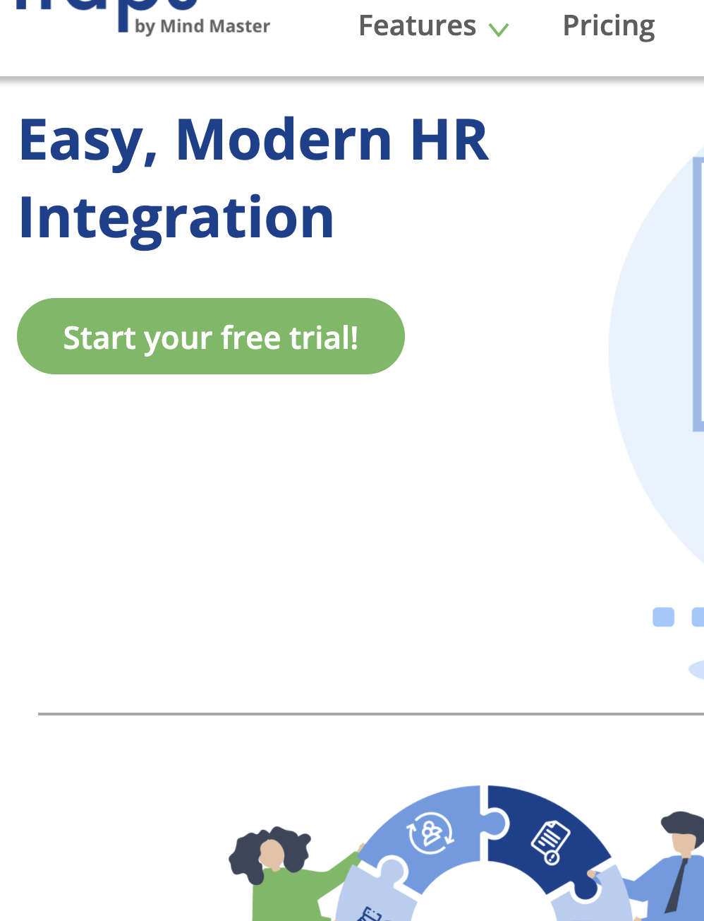
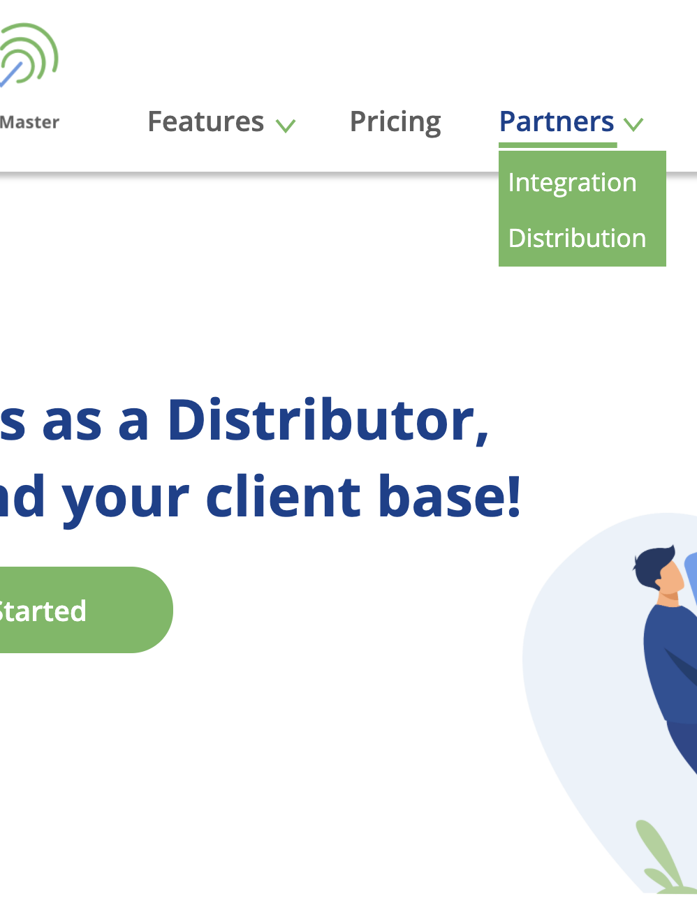
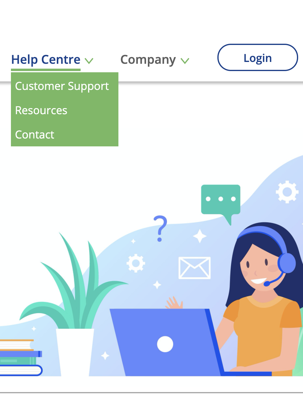
HRMS Sales Website

HRMS Sales Website

Itaps by Mind Master Solutions, Singapore

Design a sales generating website for a Payroll & HR Management software developed by an IT company.

Project Details

Project Type: Pro Bono, Group Project (team of 2) as a part of UXDI course
Role: Co-Researcher, Primary Designer, Co-Prototyper, Co-Facilitator for Usability Tests 

Duration: 3 weeks (June 2020)
Tools: Figma, Axure & Miro

Background

Mind Master Solutions, a premier IT & Business Consulting Company has developed a Payroll & HR management software “itaps”. Our goal is to assist them in creating a product website that would become a proper sales channel for itaps.

Understanding the Goal
Knowing the Users
Analysing the Scope

Define the User
Designing User Flows
Planning the Sitemap
Conceptualising the Features

Setting the Design Tone
Creating Prototypes
Testing the Prototypes

Final Prototype
Next Steps

click on the section headers to jump to the section

Discover

Understanding the Goal

The goal of the research was to understand what users look for when they visit a product website & what compels them to buy/use the product based on information they get from the website.

Knowing the User

Who are the users?

A remote interview with 6 targeted users including business owners, office admins & HR staff; helped us to map down the steps involved in the process of making a decision to buy a software.

Click on the image to enlarge

Some user insights

  • Most importantly, users want to see the features of the product
  • Some of them would want to see customer reviews of the product
  • Most of the users would like to try the product before buying it
  • Users would like to see some videos / pictures of the software dashboard to see how it actually works
  • Users also look for after sales support from the solution provider

Analysing the Scope

Competitive Analysis

Comparing the offerings of other Singapore based payroll solution softwares to evaluate the scope for the solution developed by itaps.

Comparative Analysis

Comparing itaps with some product solution sales websites to learn primarily about the trial, support & resources they are providing.

Define

Defining the User

User Persona

After understanding what users look for in a solution provider website & their frustrations, through the interviews, we came up with our user persona ‘Desmond’.

Desmond is a 38 year old businessman who started up an SME company in Singapore on renovation in late 2015. He currently has 43 employees working for him both full time (25) and on a contract basis (18). He has visions to expand his company in the very near future in Malaysia and Indonesia.

He is looking for a HR & Payroll Management Software for his company. He is doing some research online to find what suits his business the best.

Problem to Solution

Problem #1: Desmond needs more information on each feature of the software to decide on the features that are best suited for his company.

Solution #1: Feature Overview & Details
Dedicated page for main features with more information on each feature within that along with videos on how it works in the software.

Problem #2: Desmond needs to try the software before implementing in order to experience the intuitiveness & usability of the software.

Solution #2: Free 14 Day Trial
Offering a free trial valid upto 14 days & allowing the user to gain a first hand experience using the software by following quick & easy steps.

Designing User Flows

The most common actions that some new as well as existing users would perform on the website are explained in the user flows below.

1. Take up the trial of the software (new user)

2. Login to view the dashboard (existing user)

3. View resource articles for support (existing user)

Planning the Sitemap

Conceptualising the Features

Develop

Setting the Design Tone

Colors

Maintaining the blue color from the existing app, we decided to add green as a secondary color to add contrast to the designs. Also considering green color denotes progression & accomplishment which goes well with the brand statement of providing solutions to help users to accomplish their tasks easily.

Logo

The logo that I designed for the brand also conveys the message in the form of the symbol showing accomplishment (tick mark) of various tasks (the curved lines). It also symbolises that it makes the processes simplified as compared to manual paperwork.

Font

The font family chosen was Open Sans, considering the varied font weight options available within one font family itself and the simple & legible appearance of the font.

Creating Prototype (Mid Fidelity)

Considering the user needs & some common tasks the user will perform on the website that is –  taking up the trial, looking at the details of a particular feature & looking for support resources; we designed a mid fidelity prototype to check the ease of performing these tasks.

Click here to view the prototype in browser

Testing the Prototype (Mid Fidelity)

We conducted a usability test with 3 users using 5 tasks – looking up for required information & signing up for a trial, learning more about a specific feature, learning about the software, finding a specific support topic & signing up as a reseller.

2/3 users

did not realise that the features & support articles were clickable

3/3 users

felt that the partners section should further be classified into separate group for integrators & distributors

2/3 users

wanted to see contact details in support page as well

Creating Prototype (High Fidelity)

Based on the user feedback gathered in the usability test & applying the design guide to the mid fidelity design, we  developed a high fidelity prototype.

Click here to view the prototype in browser

Testing the Prototype (High Fidelity)

We conducted a second round of usability test on the high fidelity prototype with 3 users using the same 5 tasks as earlier & compared the SEQ score they shared for each task.

2/3 users

wanted to see grants & features on the home page banner

3/3 users

felt that ‘distributors’ under ‘partners’ page should be renamed to ‘resellers’

2/3 users

wanted to have an FAQs section under support

Deliver

Final Prototype

Presenting the final prototype of the website that was shared with the client for further development.

Click here to view the prototype in browser

Next Steps

  • Content / Copywriting considering the feedback shared by users
  • Screen recordings of the dashboard to be included in all the feature pages to show users how the software works
  • Onboarding videos / pictures with steps to help users when they sign up for the trial & for new users
  • Responsive layout
View other Case Studies

Remote Wound Care Solution

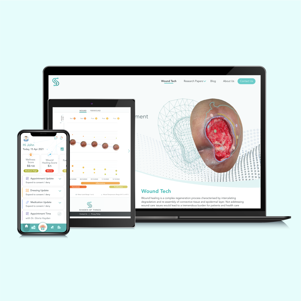
ShadesOfThings, Singapore

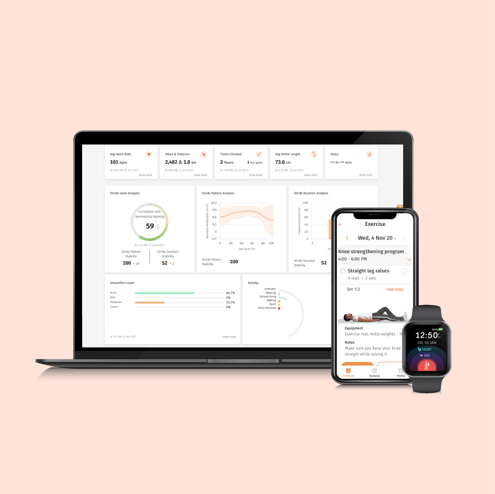
Post Op Remote Orthopaedic Care

ConnectedLife Health, Singapore

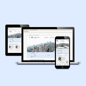
Mobile App & Responsive Website Redesign

National Library Board (NLB), Singapore

e-Commerce Website Redesign

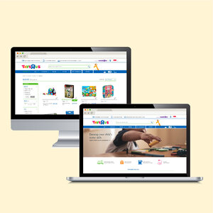
Toys”R”Us, Singapore

Mobile Game
Suggestion App

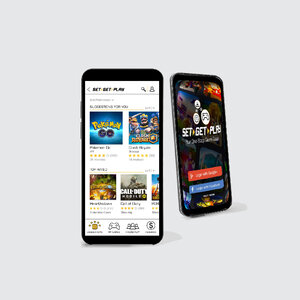
Set Get Play (Newly Developed)