sot
Remote Wound Care Platform
Wound ‘AI’d by Shades of Things, a Singapore based med tech startup
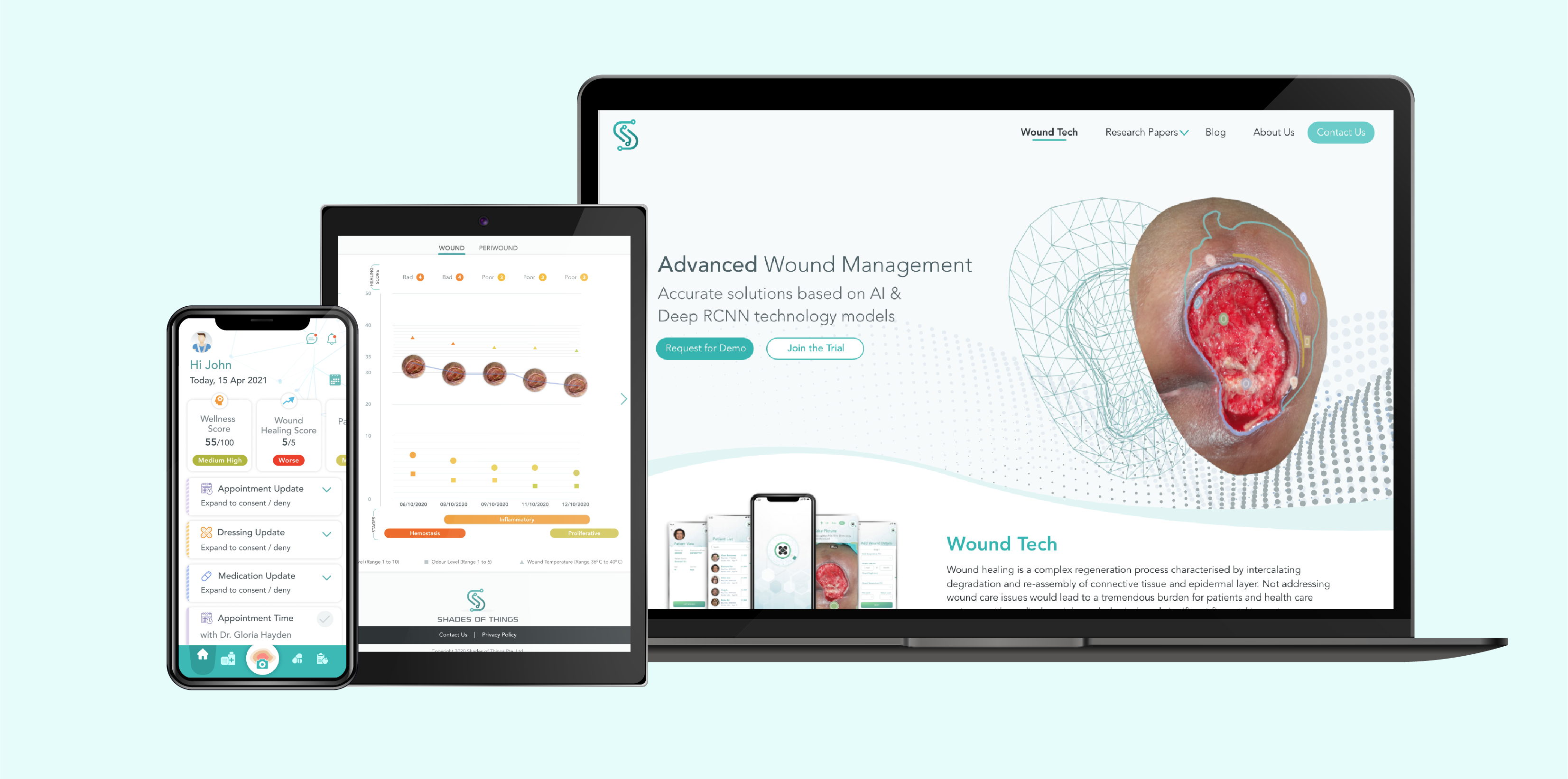
Designed a mobile app for patient, responsive dashboard for clinician and website to reach out to potential investors along with marketing collaterals.
Project Details
Project Type: Worked on it as a part of ConnectedLife subsidiary company
Role: Designer, Prototyper
Duration: 6-8 weeks
Tools: Figma, Adobe XD & Mailchimp
Background
ShadesOfThings Pte. Ltd. (SoT), is a Singapore based organization, formed with a vision to develop ground-breaking innovative products in MedTech.
The rising incidences of road accidents and injuries, growing use of regenerative medicines, and increasing prevalence of conditions that impair wound healing capabilities are the primary factors driving the market growth for Wound ‘AI’d, remote wound monitoring solution by SoT.

Discover
Understanding the Goal
Knowing the User
Analysing the Scope

Define
User Journey Mapping
Using Advanced AI Models
Problem to Solution

Develop
Setting the Design Tone
Creating Prototypes
Testing the Prototypes

Deliver
Final Prototype
Emailer Campaign
Next Steps

Discover
Understanding the Goal
Chronic wounds are a tremendous burden for patients and health care systems, with medical, social, psychological, and significant financial impact. A recent economic evaluation suggested that nearly 15% of Medicare beneficiaries experience a wound or infection in a calendar year. If adequate care is not taken or if it’s left untreated, the wound can lead to infection.
Our goal is to have a remote platform wherein the patient can take a treatment for wound at the comfort of their home and the clinician can monitor patients remotely.
Knowing the User
Who are the users?
We have two sets of users here – patient or the caregiver and doctor and his staff. In order to understand their concerns related to a remote wound management system, we spoke a few doctors / nurses in the industry and a few patients. Some of the key concerns are noted below.
Some user insights
Referring to a survey conducted in the unit of Vascular Surgery, Università Cattolica del Sacro Cuore, Rome, Italy shows below the responses shared by doctors & patients on remote monitoring of wound during Covid 19 pandemic.

During the pandemic 15.4% of the patients said that the ulcer has worsened in terms of dimensions, depth and exudation.
Analysing the Scope
For initial treatment or the first visit, an in person assessment is a must. Follow up interaction between doctors and patients is limited to two or more visits per month for patients who have gone through surgery, burns, or a significant wound. Chronic wounds are those that do not progress through a normal, orderly, and timely sequence of repair. They are common and are often incorrectly treated.
The solution aims at reducing the follow up visits with the help of continuous data collection, picture uploading, and patient’s self-labelling via their phone. The doctors can adjust treatment according to data-driven analysis derived by the advanced AI & ML models based on patient’s inputs.

Define
User Journey
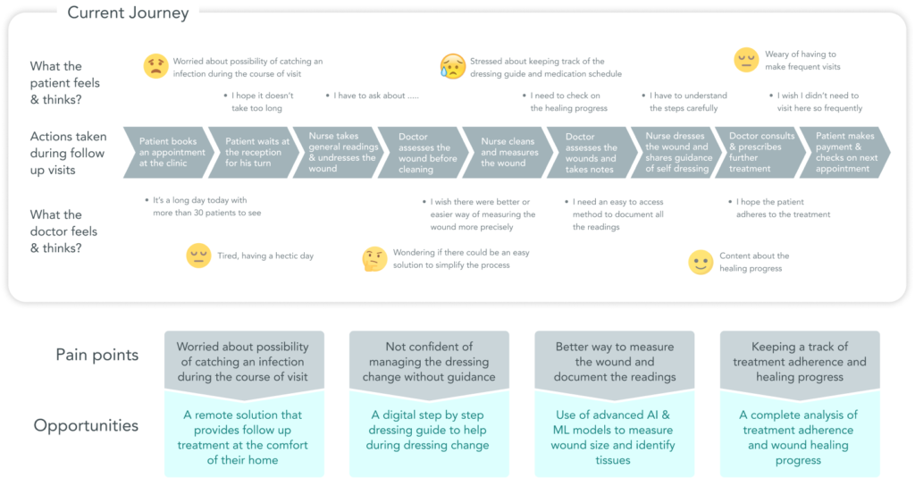
The current journey of both the set of users is defined below in terms of their actions, their thoughts and feelings. This journey is further analysed to understand the user’s pain points and arrive at opportunities to build a product that helps patients and doctors both.
Targetted User (Patient)
– Patient or caregiver of a patient with chronic wounds; bed sores; surgery, accident or wound caused by severe burns.
– Able to use a smart phone and it’s camera
Targetted User (Doctor)
– Wound specialist doctor & assisting nurse at a hospital or clinic
– Admin staff to assist in adding data for scheduling
Workflow Comparison
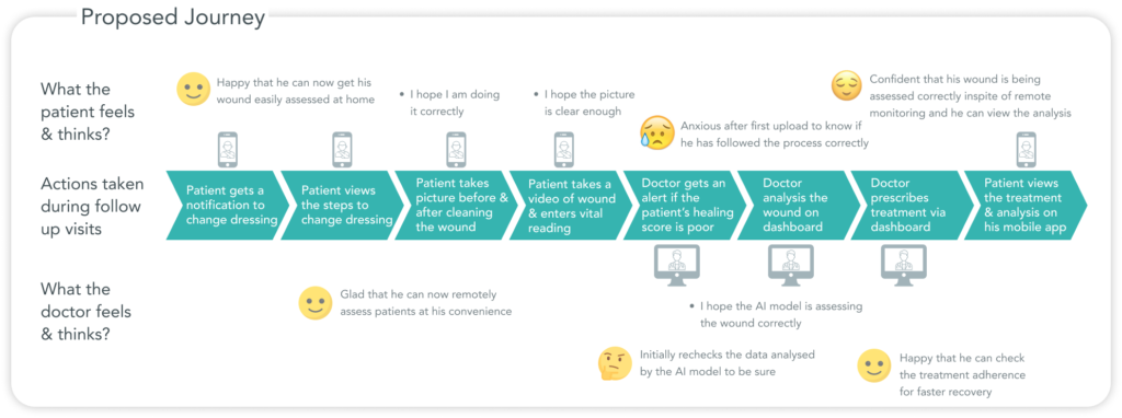
The most important change that the platform can bring to the clinician is to save his time and increase productivity. Below is a comparison between the traditional workflow that is followed at hospitals/clinics and the workflow that they can follow for all the follow up appointments after a first in person visit by the patient.
For the patient, it saves them from the time and effort invested in frequent hospital visits, helps in adhering to treatment schedules and track their own healing progress.

Traditional workflow for every visit

SOT's workflow for follow up visits
Using Advanced AI Models
The data science team used advanced AI model to make the remote analysis more accurate and convenient. The wound images uploaded by the patient go through an advanced computer vision trained model to measure the wound contour size & depth and detect the edge type. It can also identify 27 different tissues and more using customized AI and DL (Deep Learning) models.

Wound Characteristics mapping based on curvature, texture, edge, sharpness & colour change
Problem to Solution
Problem #1: Patients are not sure how and when to change their wound dressing.
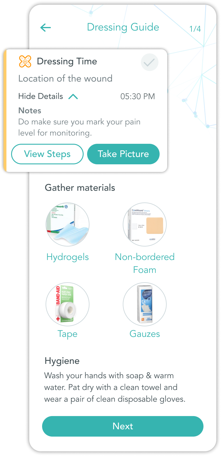
Solution #1: Dressing schedule, reminder & guide
The patient will get a reminder to change the dressing, take medication and if there is update to both. There is also a list of materials that are needed to change the dressing and a 5 step guide on how to change it. Going ahead, we are introducing smart bandages, which will be synced to the patient app to detect fullness of bandage.
Problem #2: Clinician needs to track the patient’s healing by measuring the wound size & identifying tissues
Patients need to be sure that any kind of infection is being noticed.
Solution #2: Advanced AI model
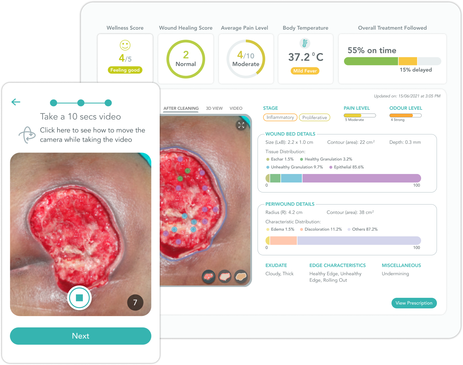
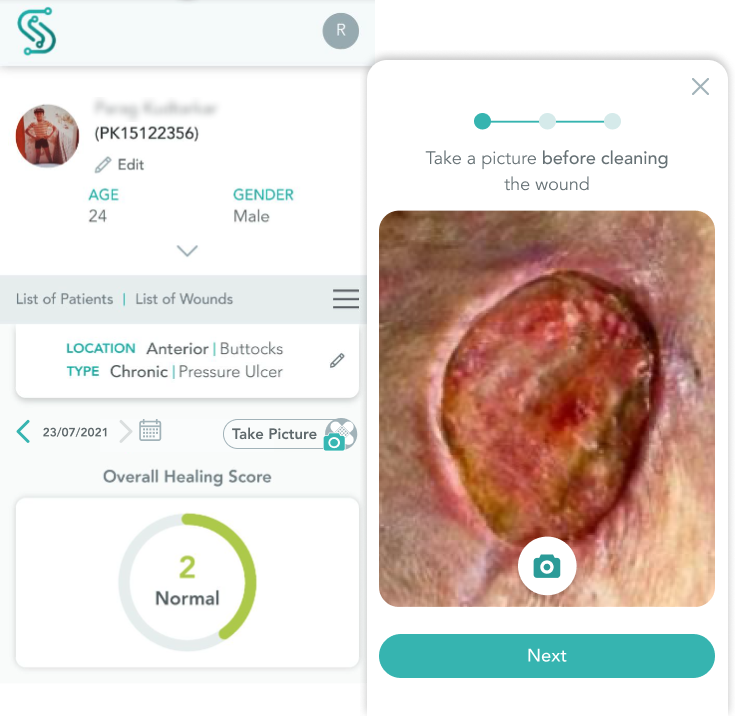
Our advanced AI machine learning & deep learning model will track the wound size using the picture & video uploaded by the patient. It will also generate a 3D view and can identify up to 27 different tissues which will alert the clinician of a potential infection & overall healing progress of the patient. The model is also trained to generate an overall healing score calculated as per the changes in wound size and tissues identified.
Going ahead, using a smart bandage will also help to measure the periwound temperature which is an indication of inflammation and alerts the clinician for assessment.
Problem #3: Patients need to adhere to their treatment and clinicians need to track if the treatment is being followed.
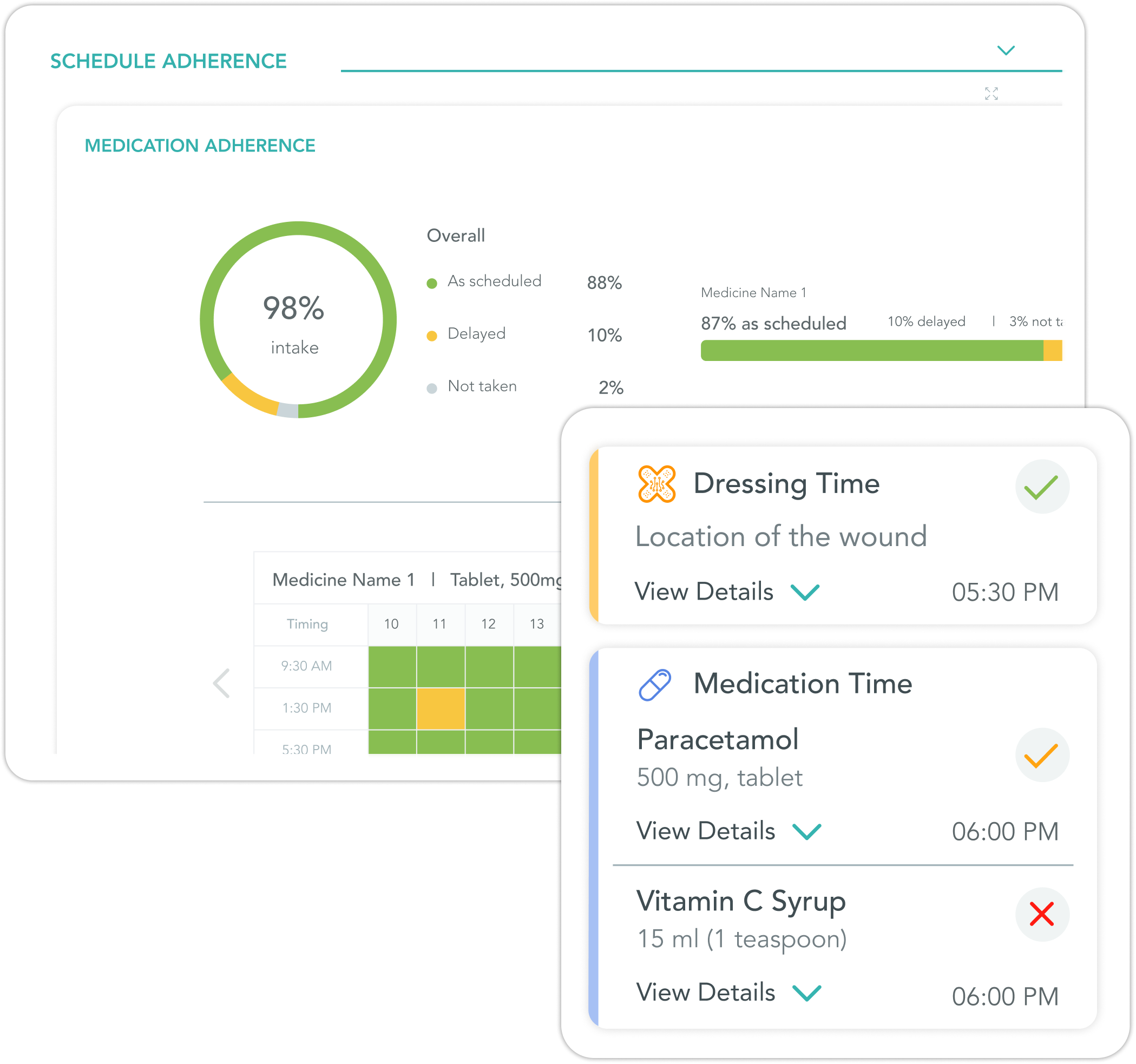
Solution #3: Marking treatment schedule on app and displaying adherence analytics on dashboard
The patient marks the treatment schedule – medication and dressing as done after getting a notification at the time it is scheduled. This marking is displayed on the app for patient’s reference and on the clinician’s dashboard for him to track the treatment adherence. Adherence to the treatment helps in faster recovery.

Develop
Setting the Design Tone
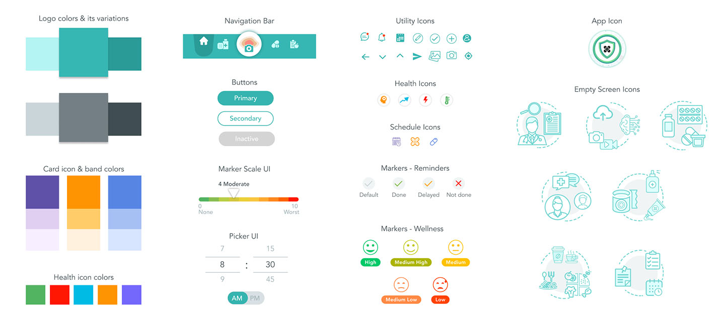
Colors
A subtle combination of sea green with a bluish grey shade, the two colors used in the logo are the primary colors. To make the app a bit more vibrant, colors are added to the different cards, their icons and to the graphs.
Font
The font family used is Avenir considering the varied font weight options available within that and a simplistic approach.
Patient App Prototype (High Fidelity)
Wound ‘AI’d mobile application allows to get reminders on dressing change, medication intake and appointment schedule.
The patient can take a picture & video of the wound before & after cleaning and track vital readings like body temperature, pain & odour levels.
Click here to view the prototype in browser
Clinician Dashboard Prototype (High Fidelity)
The clinician dashboard application displays markers on the wound bed and periwound image in a unique way for the clinician to decide on medication and dressing. Every wound image is given a wound healing score based on the wound and periwound characteristics, pain level, odour level and other conditions reported. The clinician can view a historical and graphical representation of all the conditions in order to check the overall healing.
Click here to view the prototype in browser
Admin Dashboard Prototype (High Fidelity)
The dashboard application for admin is a supporting profile that helps in adding clinician and patient profiles as well as in adding medications, dressing materials and ingredients for nutrition module. An admin can also assign a clinician to a patient and alert them when they notice something critical on patient’s analysis.
Click here to view the prototype in browser
Launch Emailer Campaign Prototype (High Fidelity)
An introduction and invitation emailer followed by a newsletter was shared with potential clinicians, investors and hospital authorities before the start of clinical trials.
Click here to view the prototype in browser
Usability Tests
A usability test was conducted with a few clinicians on the MVP version of the platform to check the working of the model and the transfer of data from app to the dashboard. Some of the key outputs of the test were:
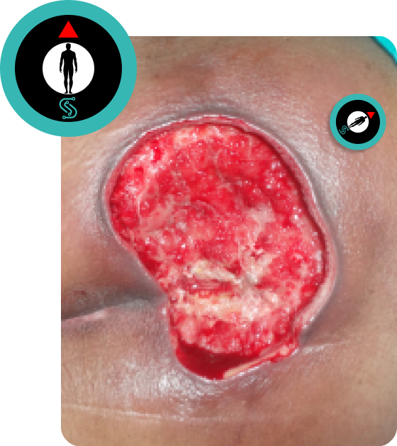
The orientation of the wound was not evident. Also, the color profiles were varying based on the external lighting.
Placing a sticker/token close to the wound while taking a picture
The patient are to be provided with a token which they have to place near the wound. The orientation is required to be in line with the human body graphic and an arrow indicated in the token. The colors of the token were of contrast hues, that helped the AI model to correct the color of the picture no matter how the external lighting is.
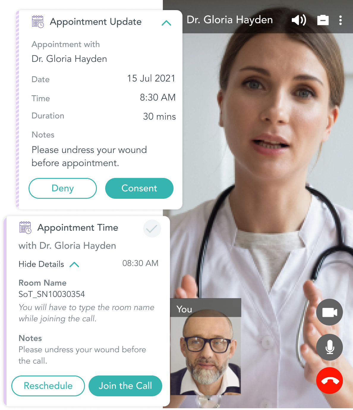
The clinician preferred to use the same platform to schedule follow up video appointments
Integrating Twilio API
We introduced an appointment scheduling flow with the help of Twilio wherein the clinician will schedule an appointment via the dashboard. The appointment schedule will be shared with the patient on the mobile app for confirmation. Once confirmed, they will both get reminders to join the appointment with the help of Twilio video call API.
For the first consultation, the clinician preferred taking the pictures on the dashboard
Adding camera and upload picture features to the tablet & mobile responsive dashboard
To allow the clinician to use the platform for all the requirements, we added a camera & upload picture flow for the mobile and tablet responsive versions of dashboard that allowed the clinicians to use take pictures of the wound for first consultation and for any in person follow up.
Next Steps
- Integrate a nutrition prescription and adherence model
- Onboarding videos for patient and clinicians
- Smart bandage integration flow
- Smart watch integration to track motion in order to prevent bed ulcers
- Design a B2C flow for the application wherein the customer can buy a smart bandage and pay for the app to get started with the application and then invite a clinician or care giver
View other Case Studies
Post Op Remote Orthopaedic Care
ConnectedLife Health, Singapore
Mobile App & Responsive Website Redesign
National Library Board (NLB), Singapore


